About LifeWell
LifeWell is a new activewear brand with a different purpose: bringing psychology and physical education together to transform how people see and experience life. More than activewear, each piece is designed to amplify sensations, strengthen the connection between body and mind, and express wellbeing in every detail. Navas built the brand from the ground up, from branding to the website and launch concept.
Challenge
The fitness market is already large and full of brands talking about performance, results and pushing limits. LifeWell needed to occupy a different position: appealing to people who want to feel more rather than simply train harder, bringing the psychology of neurotransmitters into its proposition as a meaningful difference. We needed a vibrant, sensory identity with the strength required of a new brand entering the market.
Solution
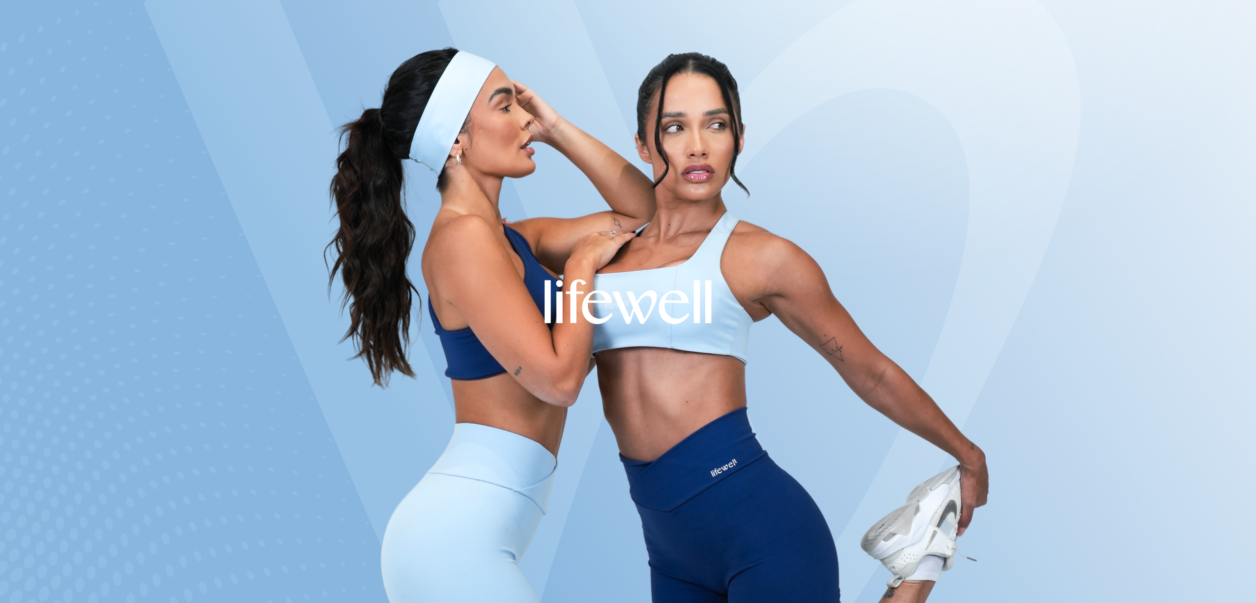
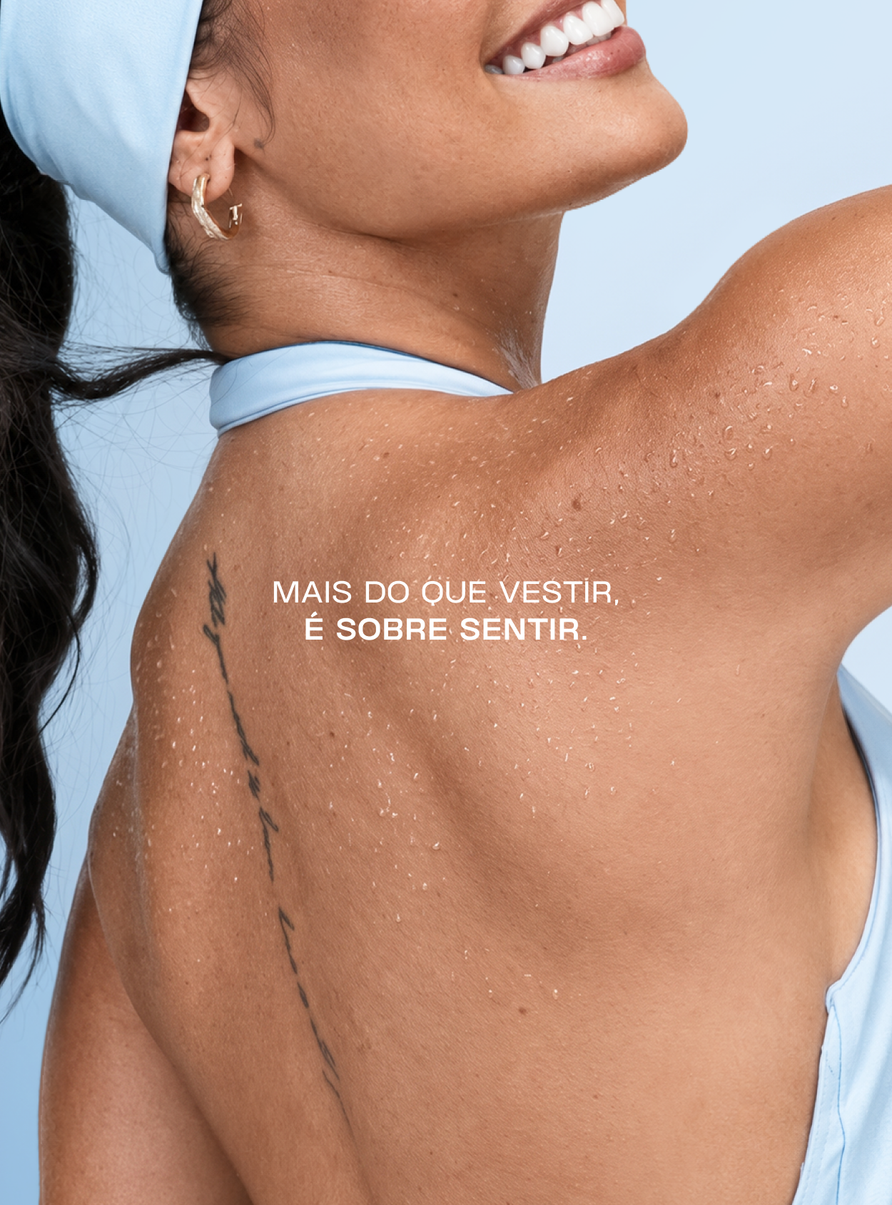
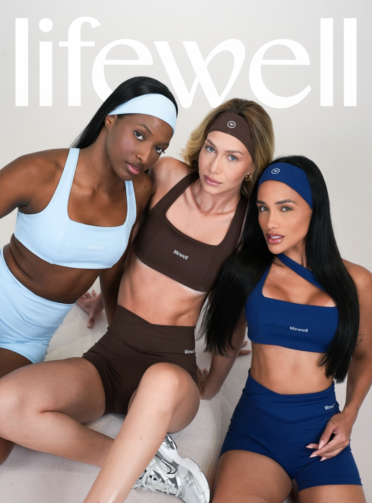
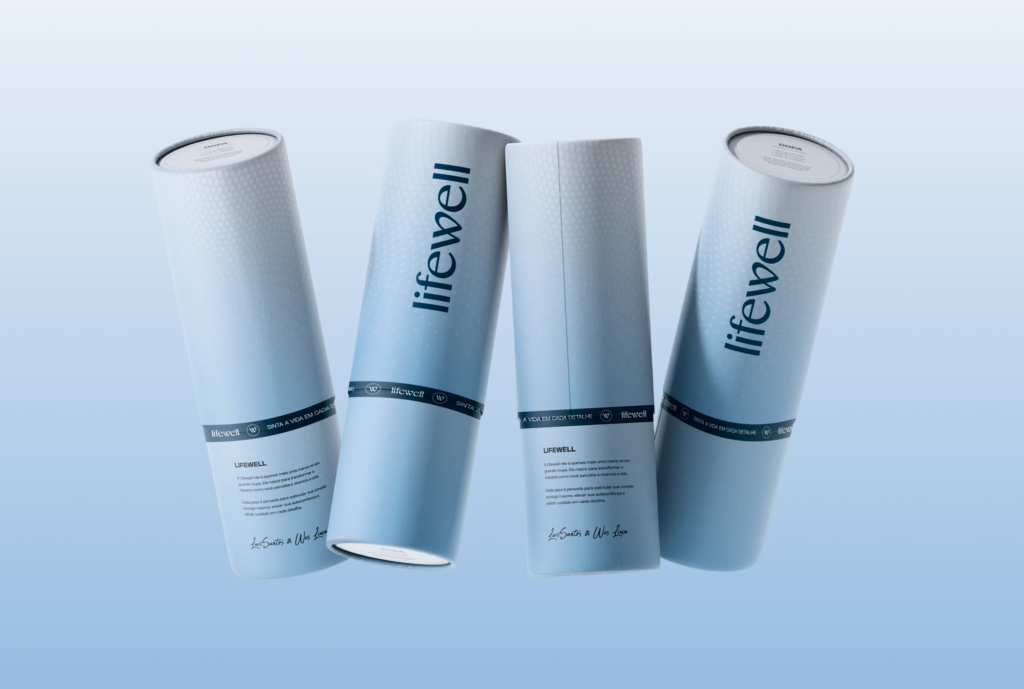
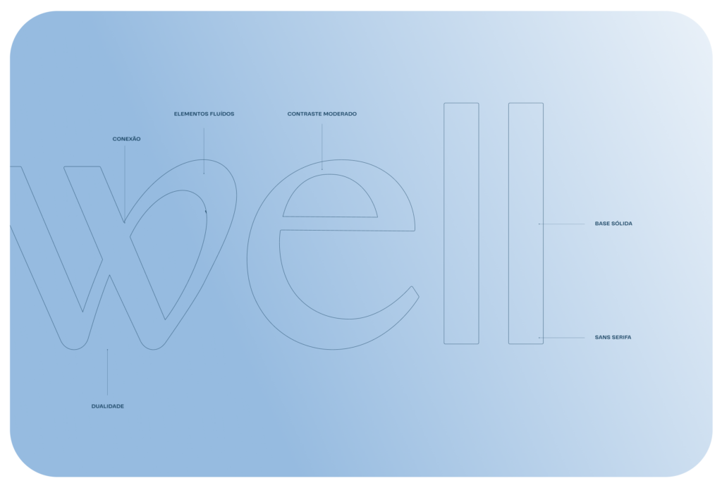
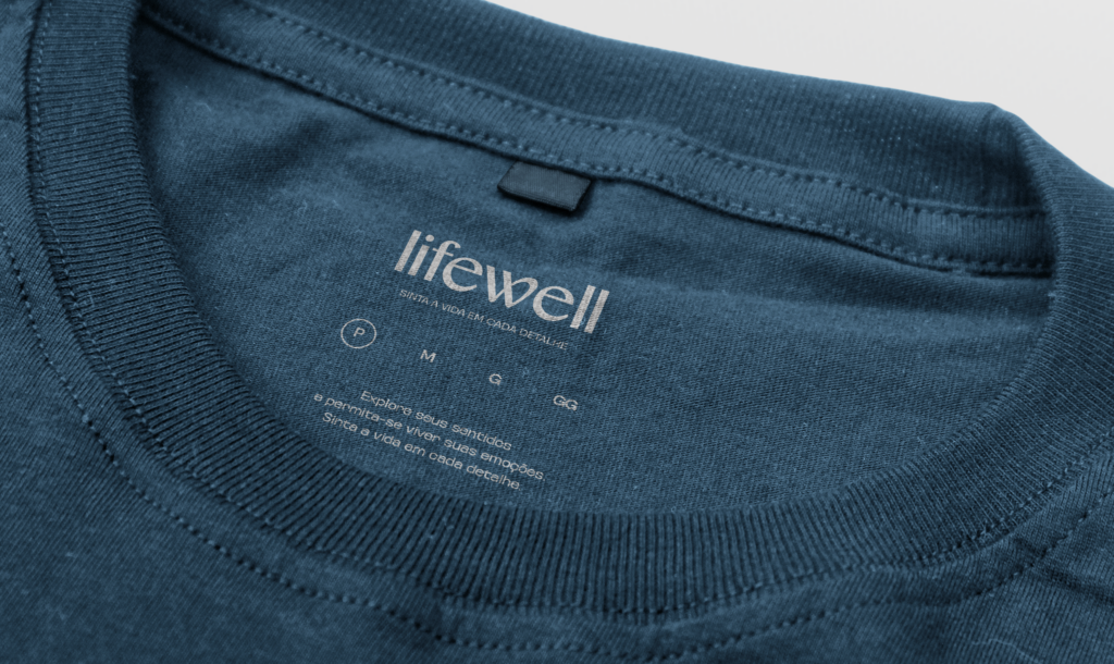
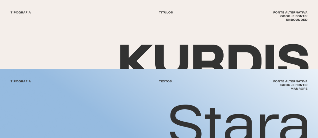
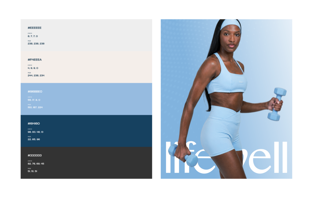
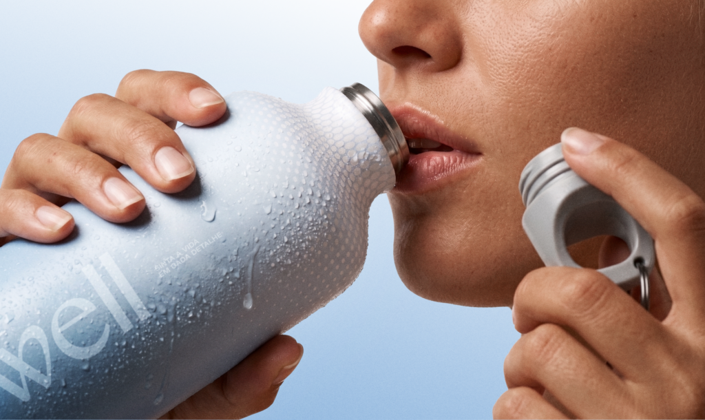
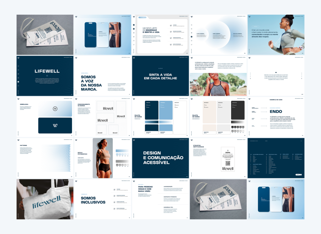
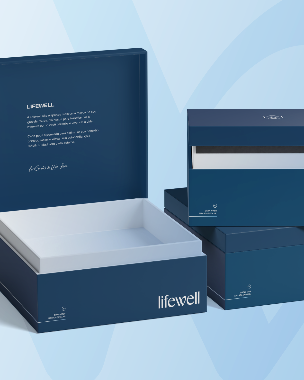
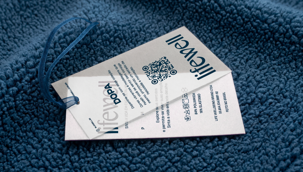
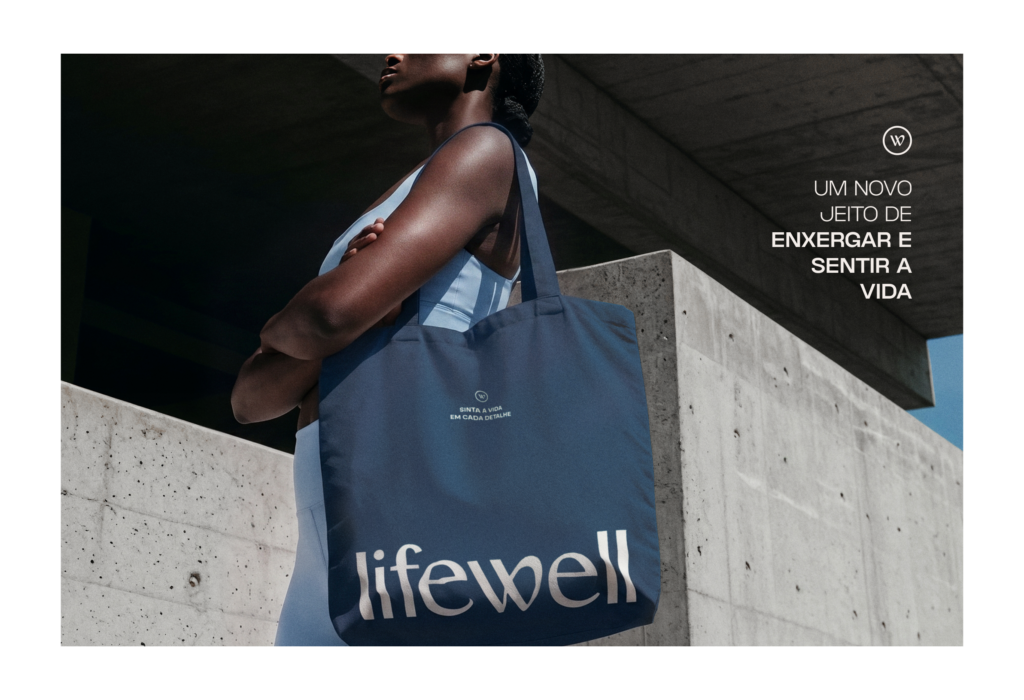
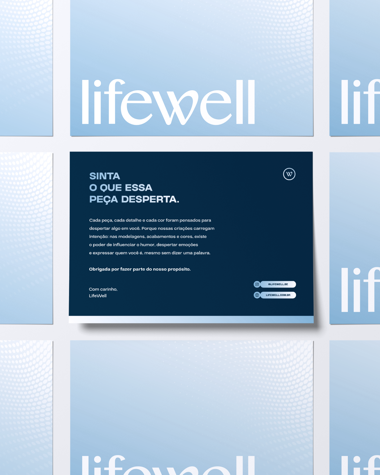
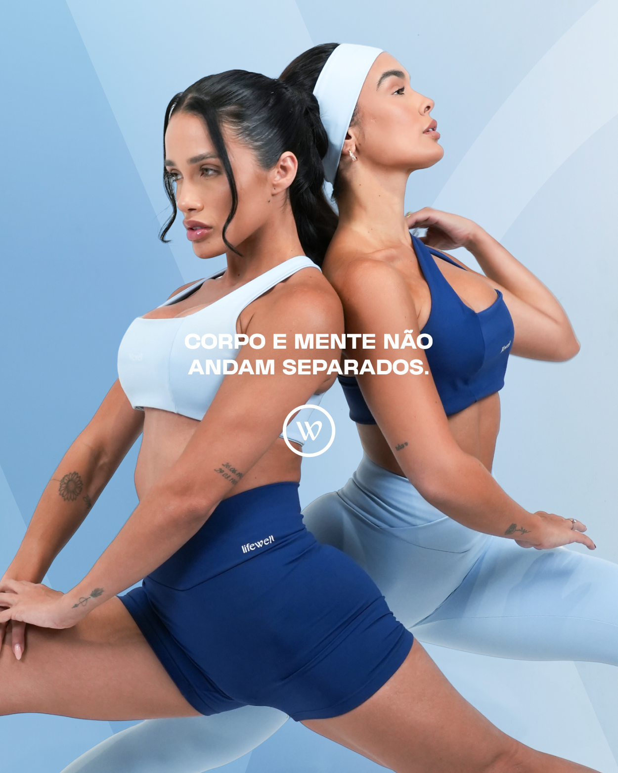
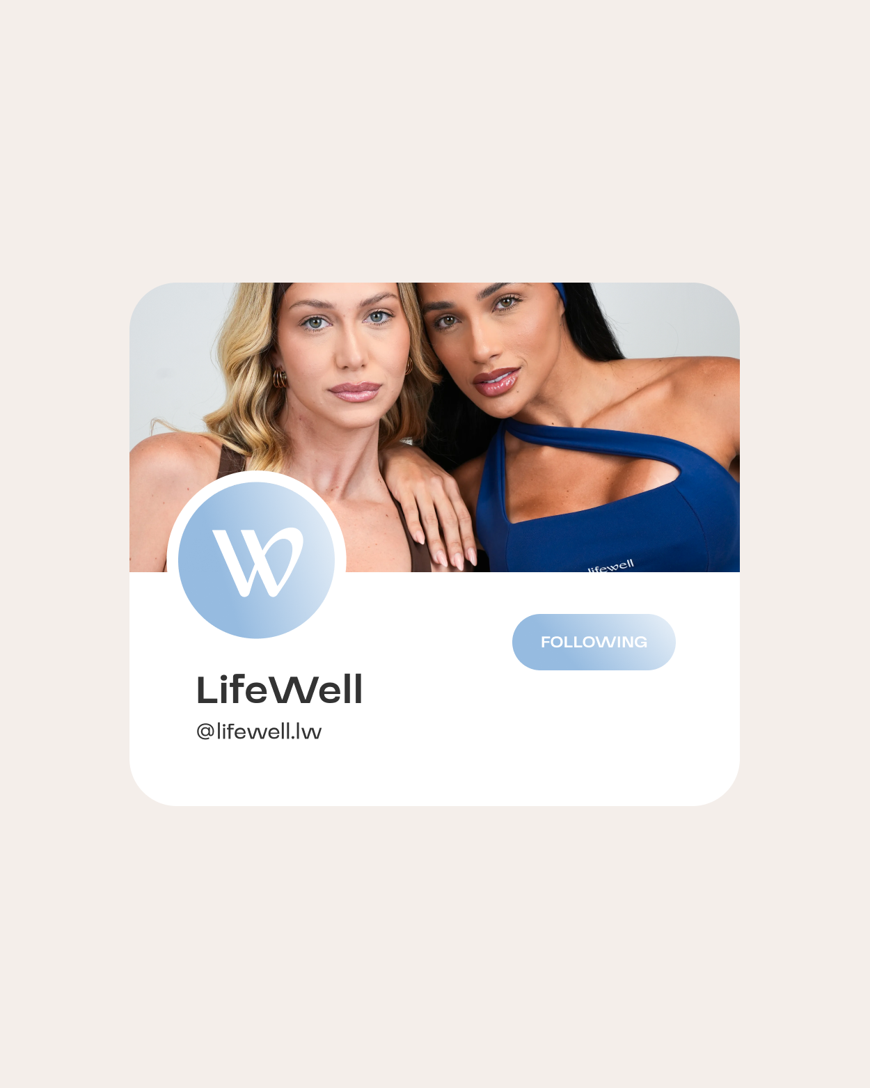
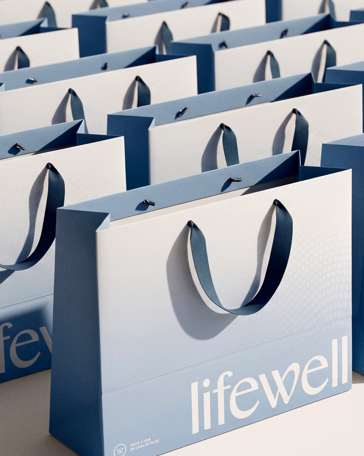
Navas developed LifeWell’s complete branding, from its brand platform, purpose, values and personality through to verbal and visual identity. The logo combines fluidity and solidity, representing the duality between body and mind at the heart of the concept. The colour palette, photographic style and custom pattern reinforce movement and wellbeing across every touchpoint, from the website to the brand’s launch concept.
Location

About the process
The project began with the brand platform, developing a deep understanding of LifeWell and how it should communicate before making any creative decisions. From that foundation, we developed the brand’s verbal and visual resources, building an identity that would support all its communication. We then moved to the website, applying that identity to a real browsing experience. Finally, we created a launch campaign designed to introduce a completely new brand to the market with a clear structure and a strong presence from the outset.
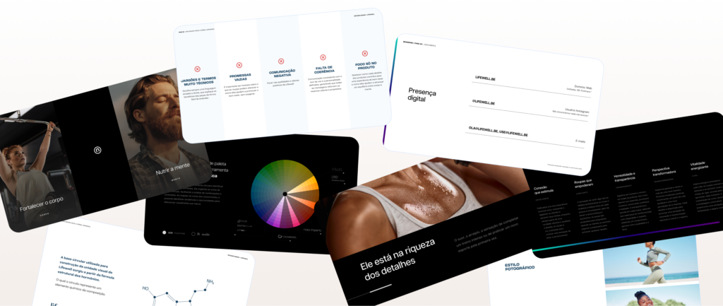

LifeWell’s branding was built around duality: the meeting of body and mind, physical education and psychology, which is the brand’s reason for existing. This idea appears in the logo, where the letter L becomes the structural foundation for the W, bringing the initials together in a single symbol. Fluid curves suggest movement and lightness, while a solid base conveys confidence and stability, reflecting the balance the brand seeks to evoke in those who wear it. This duality extends to a verbal identity with an inspiring, approachable tone, and to the colour palette and pattern, which reinforce fluidity and connection throughout the brand’s communication.

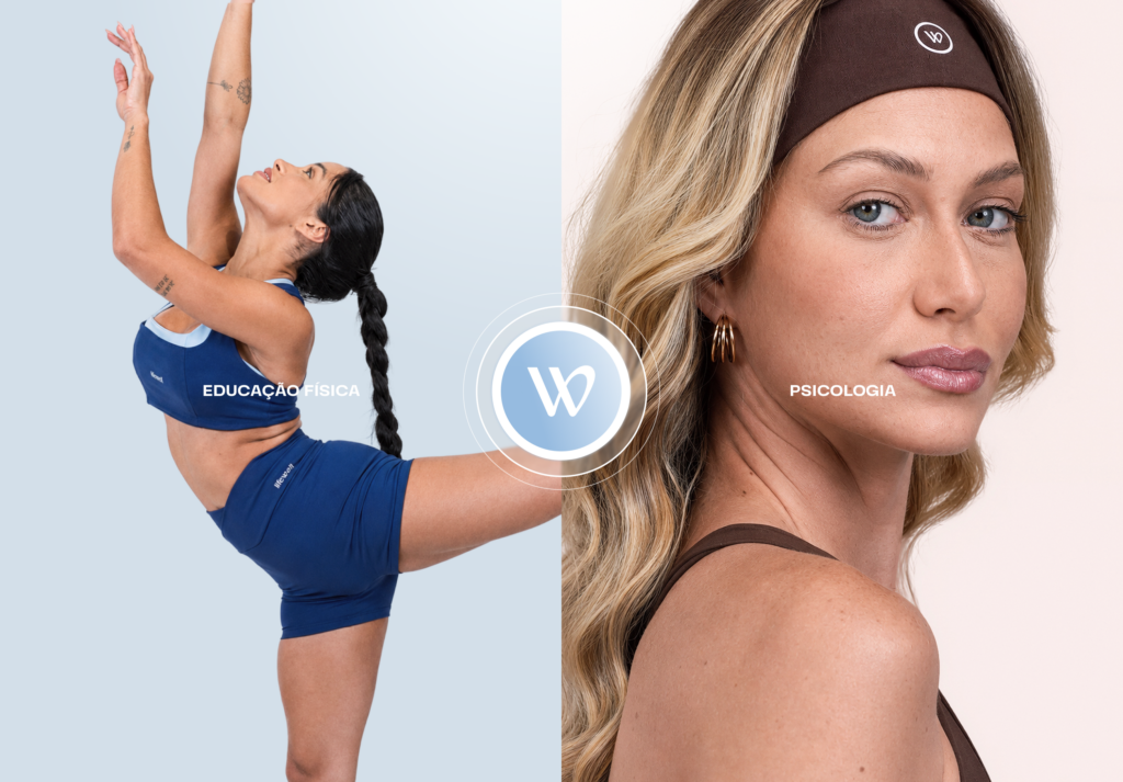
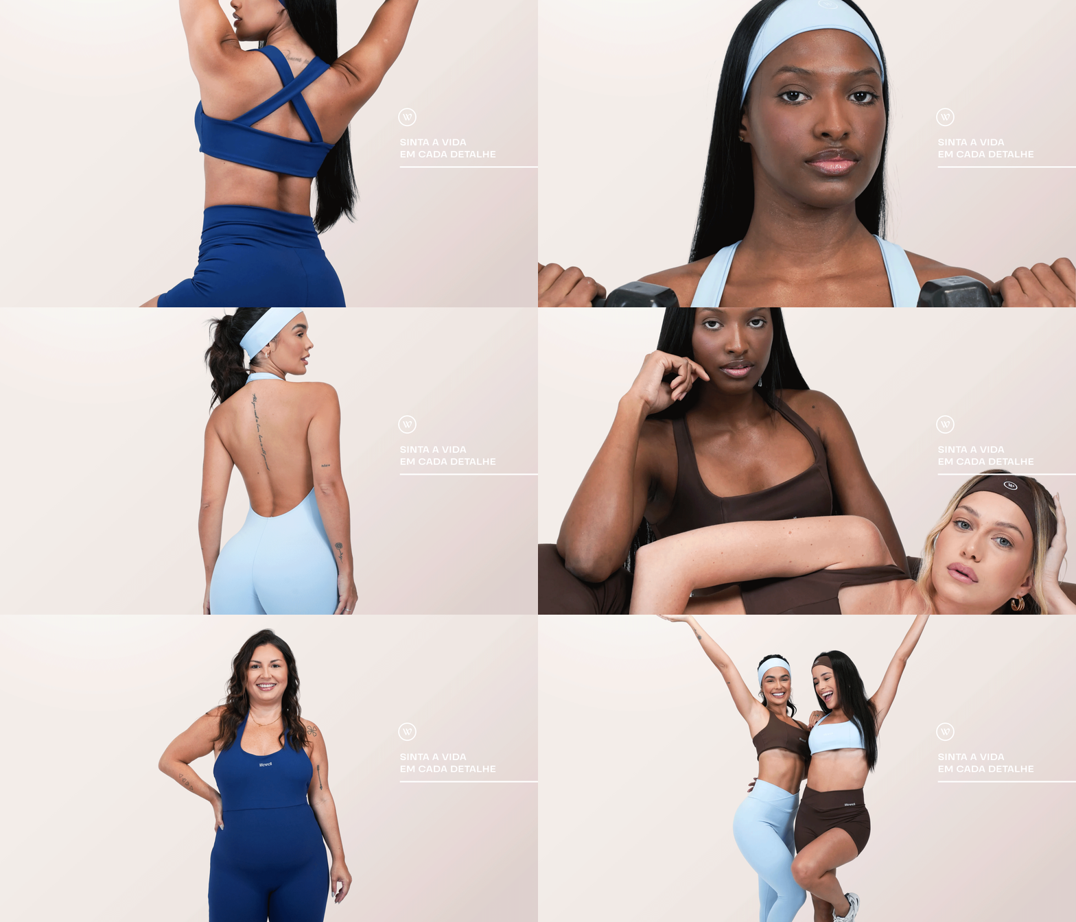
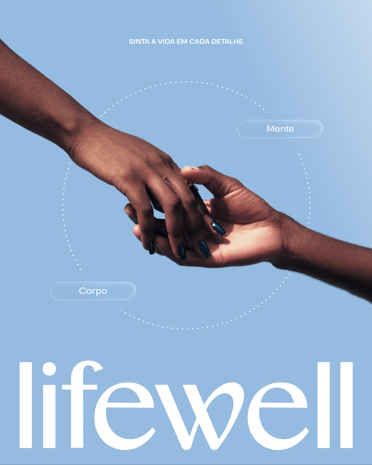
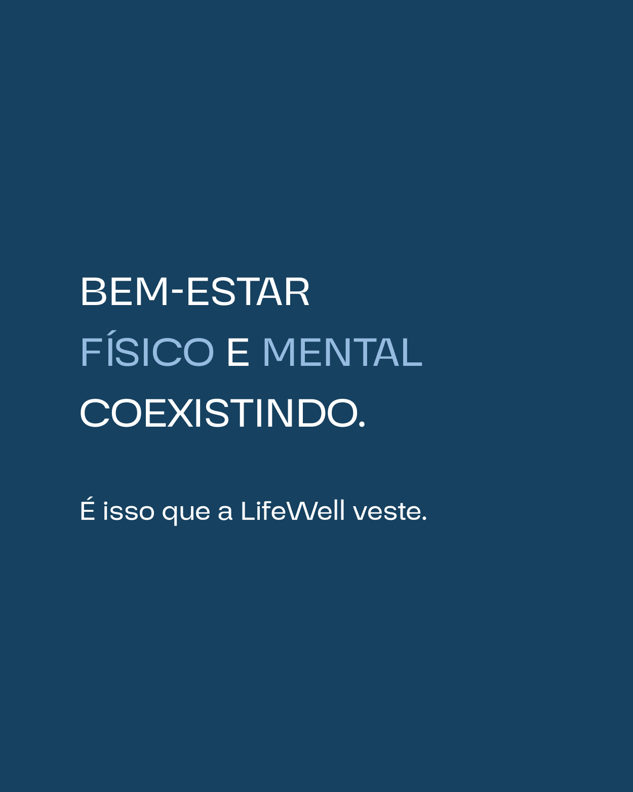

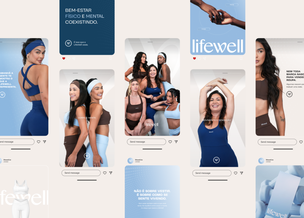
The concept was designed to introduce the brand to the market. Behind the project is Lari Santos, a public figure with an established presence. The challenge was to make her personal influence and the strength of the new brand work together, adding to each other rather than competing for attention. The launch therefore drew on the language, tone and visual identity already defined, creating a narrative that clearly introduces LifeWell: who it is, what it represents and how it enters the market with a strong identity from day one.


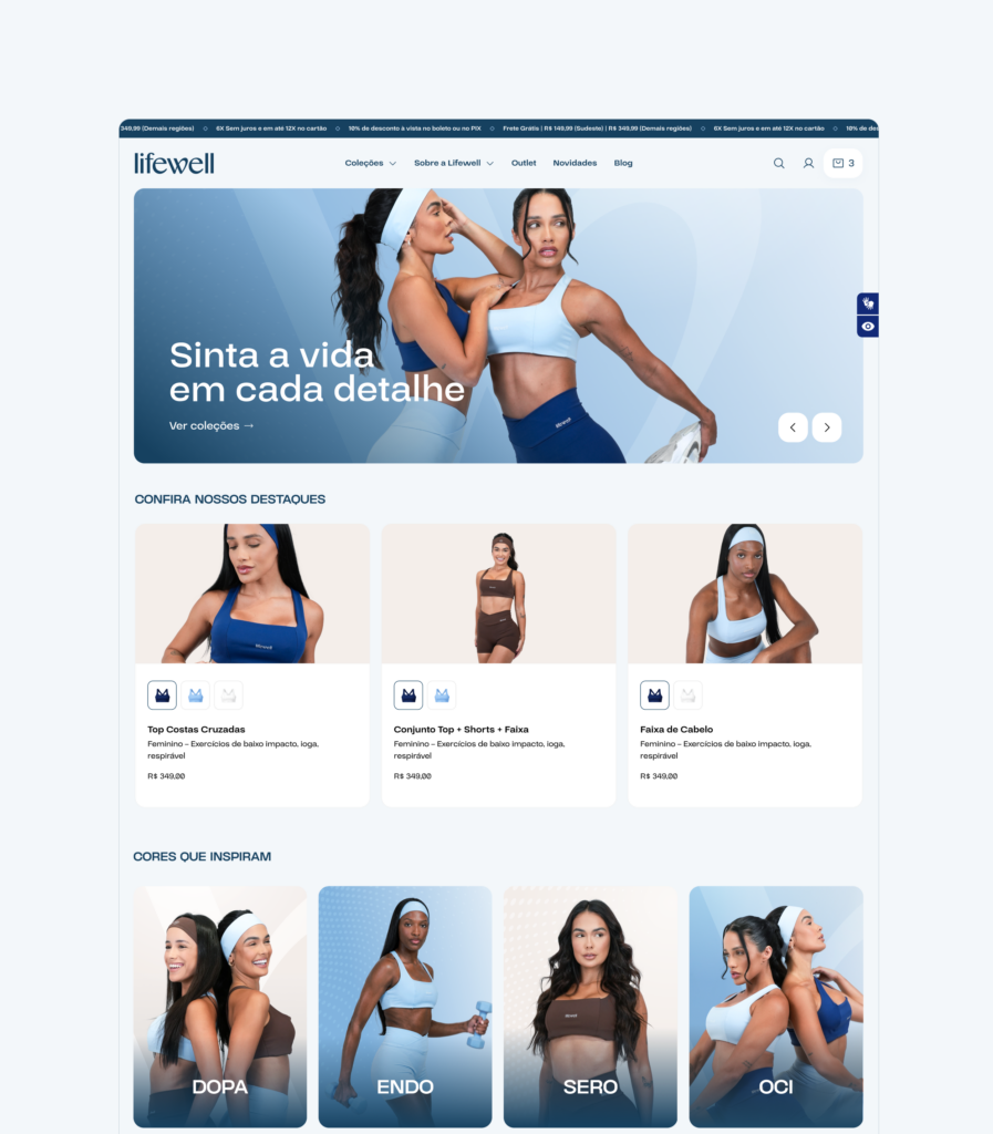
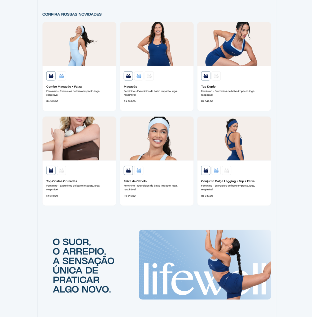
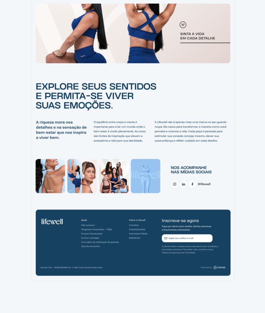
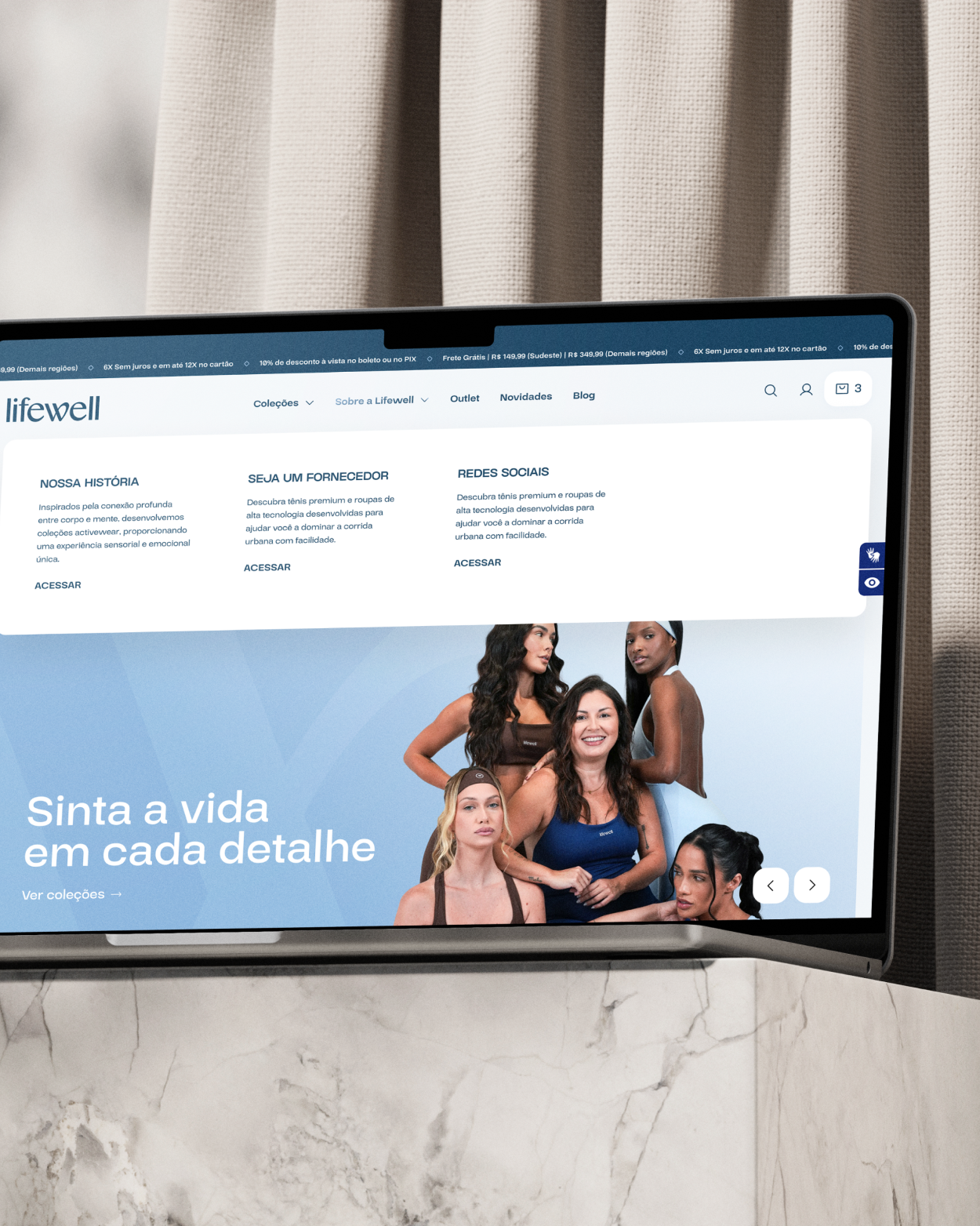
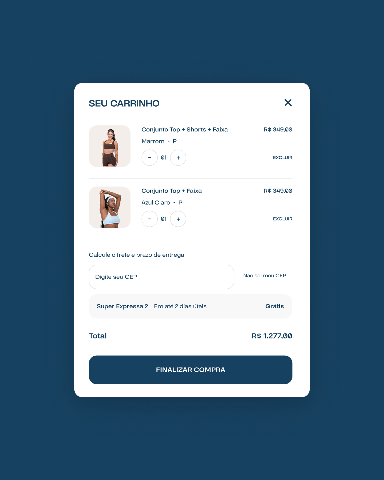
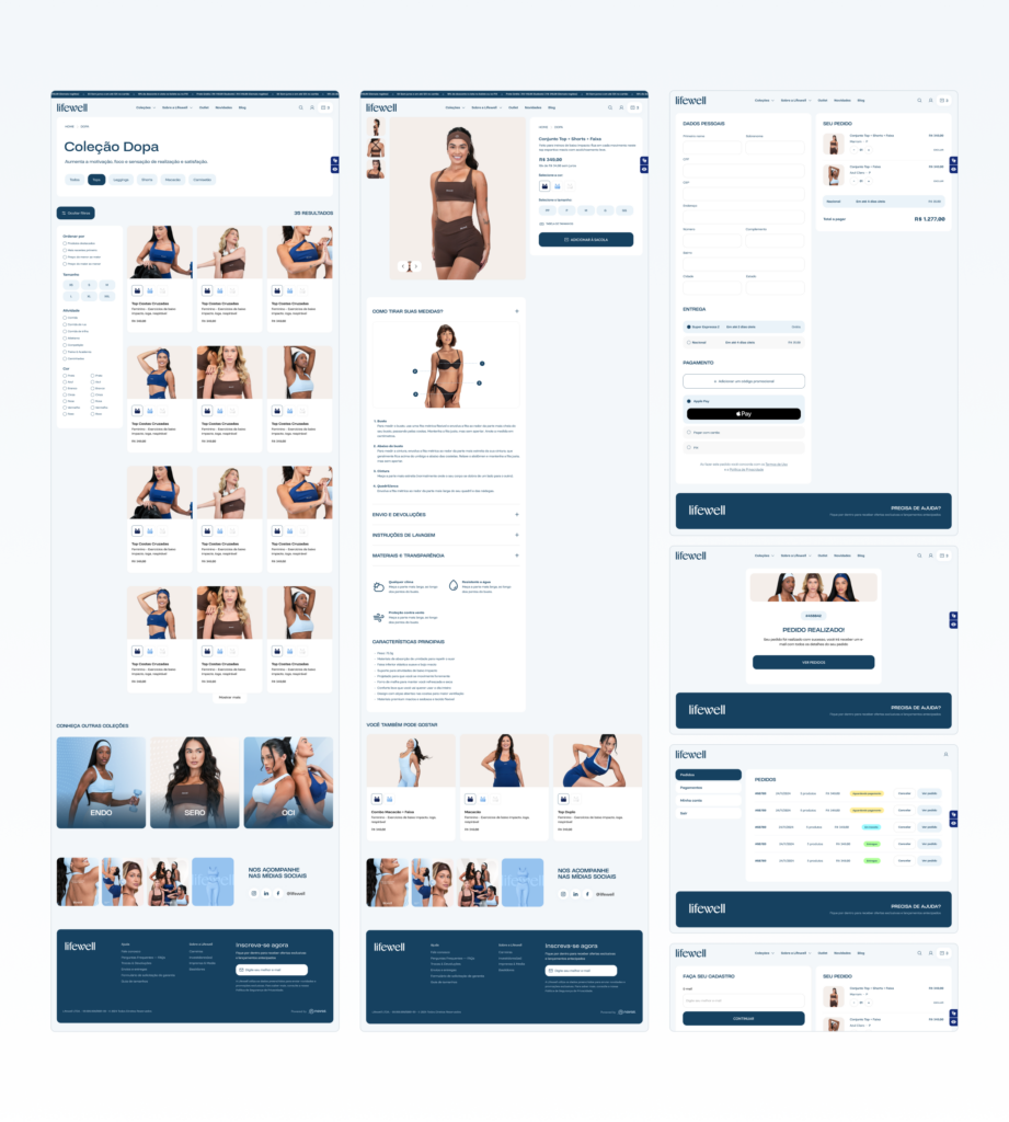
The website was developed with a focus on sales, extending the brand experience directly into the digital environment. Navigation carries the visual and verbal identity into a structure designed to guide visitors smoothly from their first encounter with the concept to conversion. Each section reinforces LifeWell’s sensory character and positioning, making the platform another strategic touchpoint for generating results.